If you had to describe the The Simpsons art style, what would you say? Most people think of simple shapes, bold black outlines, a funny overbite, and, of course, that bright yellow skin. It’s almost like every character is made from a simple set of toy blocks.
What Makes The Simpsons Art Style So Unique

Why can you spot a drawing of Homer or Bart from a mile away? It’s not by chance. It’s a set of smart design choices that have made the show a pop culture staple for decades. The whole look is built on being simple and consistent so anyone can recognize it.
This look didn’t just appear overnight. The art style has changed a lot since the characters first showed up as rough sketches on The Tracey Ullman Show back in 1987.
Back then, creator Matt Groening’s drawings were much rougher. But over more than 30 seasons, the animation has been cleaned up and polished. This helped the show keep its signature look even as animation technology got better.
The Core Visual Ingredients
The magic of the Simpsons look comes down to a few key things that all work together. These rules make sure every character, from Marge Simpson to the Squeaky-Voiced Teen, looks like they belong in Springfield.
For a quick summary, here are the main parts that define the show’s famous visual style.
| Core Elements of the Simpsons Look | |
|---|---|
| Visual Element | Simple Description |
| Simple Geometric Shapes | Characters are built from basic circles, ovals, and rectangles. |
| Bold Black Outlines | Thick, even black lines make every character stand out. |
| The Famous Overbite | Most characters have a noticeable overbite, creating a unique look. |
| Minimal Detailing | Features are kept simple, like a curved line for a nose or hands with four fingers. |
| Vibrant Yellow Skin | The unforgettable yellow color makes the characters instantly pop. |
These simple but strict rules are what make the show so charming and the art style so easy to recognize.
A Closer Look at the Rules
Let’s look a little closer at these visual rules.
- Simple Geometric Shapes: Think about Homer’s head, it’s basically two circles. Bart’s hair is just a row of spikes. This makes the characters very easy to draw and, more importantly, to animate the same way in every frame.
- Bold Black Outlines: Every single character and important object has a thick, even black line around it. This is a classic animation trick that makes everything feel solid and pop off the background.
- The Famous Overbite: Look closely at most characters in Springfield. You’ll notice their upper lip and teeth hang slightly over their lower jaw. This little detail creates a unique and consistent face shape for the whole cast.
- Minimal Detailing: Why add extra lines if you don’t need them? Noses are often just a simple curve, and hands famously have only four fingers. It keeps the look clean and simple.
But the most important part has to be the skin color. That bright, hard-to-miss yellow is what truly makes the characters jump off the screen. It’s become their most famous feature.
Of course, the Simpsons aren’t the only ones known for a unique color. If you’re curious about this, you can find a whole world of other yellow characters in our detailed guide. Art is always finding new ways to express itself, and it’s interesting to see how visual styles change, from cartoons to things like the evolution of hyper-realistic tattoo styles.
How The Art Evolved From Sketch to Screen
The polished, famous simpsons art style we all know today didn’t just appear suddenly. It was a long journey of creative changes and new technology that took the characters from rough sketches to the clean animation we see on TV. When the family first appeared on The Tracey Ullman Show, they looked raw and messy. That’s because they were taken directly from creator Matt Groening’s quick drawings.
That early look was full of shaky lines and shapes that changed from one moment to the next. Once The Simpsons got its own show in 1989, the animation team slowly started to clean things up. They worked to create standard models so Homer always looked like Homer, but they were careful to keep that special hand-drawn feeling.
The Big Digital Leap
The first major change happened in the mid-90s when the show started moving from physical drawings to digital tools. The studio began using digital ink and paint, which was a huge change from the slow and costly process of hand-painting every single frame. Suddenly, the colors became very bright and consistent in a way that regular paint just couldn’t do.
This visual change didn’t happen all at once, as you can see below.

This timeline really shows how the art style grew up. It went from its messy beginnings to the sharp, clear look that defined the show’s best years.
The jump to digital was slow. The show first tried digital coloring in 1995 with the season 7 episode, “Radioactive Man.” It wasn’t until season 14 that the whole process went digital, making animation much smoother. But this progress came with new problems. When The Simpsons switched to high-definition (HD) broadcasting in 2009, the team had a shock: all the old, standard-definition backgrounds were now useless. The sharp HD quality showed they weren’t detailed enough, forcing animators to redraw lots of familiar Springfield places from scratch.
The main challenge has always been to use new tools that make work faster without losing the classic, hand-drawn feel that fans love. It’s a careful balance between technology and tradition.
Keeping the Look Consistent
As the simpsons art style grew from TV screens to t-shirts and lunchboxes, keeping the look the same became a huge job. Making sure that specific “Simpsons yellow” is the same on a screen as it is on a printed poster is surprisingly hard. As the brand moved to different types of media, using ideas from guides like Mastering Color Management in Printing became very important.
This dedication to consistency is a big reason why the show’s style has stayed so unique and easy to recognize for more than 30 years.
The Hidden Rules of Simpsons Character Design

There’s a lot more to the Simpsons art style than just yellow skin and thick black lines. If you look closer, you’ll find a secret design language, a set of unwritten rules that every Springfield animator knows. This is where the real magic happens. It’s a clever system of small but strict rules that give the characters their unique feel and surprising emotional range.
Once you know what to look for, you’ll see these rules everywhere. One of the biggest, and easiest to miss, is the ‘no straight lines’ rule for characters. Seriously, take a close look at anyone from Homer to Mr. Burns. You’ll notice their bodies are made almost entirely of curves. Their arms, legs, and even their chests have a slight bend, giving them a soft, rubbery feel. It’s a simple trick, but it keeps them from looking stiff or robotic.
Crafting The Springfield Look
This focus on curves is the base for the whole look. The two most famous features, the bulging eyes and the famous overbite, are also drawn with amazing consistency. They aren’t just random sketches; they’re specific, repeatable shapes that keep the show’s visual style easy to recognize after all these years.
For example, the eyes are never perfect circles. They’re a little bit oblong and always sit right on top of the nose and muzzle area, never floating above it. That exact placement, along with the overbite, creates the classic Springfield face we all know.
“The style is built on simple, repeatable shapes. But the emotion comes from how those shapes are combined and changed. It’s a very clever system that allows for surprisingly detailed acting from characters who are, on the surface, very simply drawn.”
This system is what gives the characters such a huge range of expressions. A tiny change to an eyelid’s curve or the shape of a mouth can show everything from pure anger to quiet sadness.
The Power of Limited Choices
You’d think a world as colorful as Springfield would need an endless rainbow of colors, but that’s not true. The show actually uses a surprisingly limited color palette. Each main character has a strict set of colors for their clothes and hair. This makes them stand out and helps us spot them in a second, no matter how busy the scene is. It’s a smart choice that keeps the visual style clean and easy to understand.
That same “less is more” idea applies to the animation itself, especially for talking. Animators don’t draw a brand-new mouth for every single sound. Instead, they pick from a library of dozens of pre-designed mouth shapes.
- “O” Shape: Used for sounds like “oh” or “whoa.”
- “E” Shape: A wider mouth for sounds like “me” or “see.”
- Frown: A simple downturned curve to show sadness or disappointment.
- Smile: An upturned curve that can be wide or small.
This might sound restrictive, but it’s actually helpful. With this set library, animators can focus their energy on the timing and performance, the acting, instead of getting stuck redrawing basic shapes for every frame.
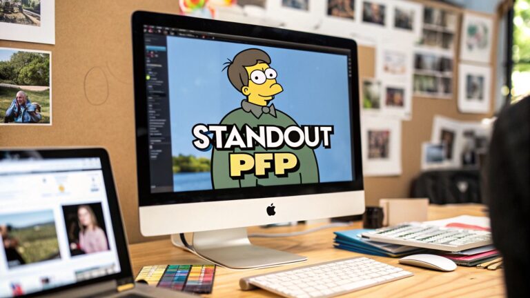
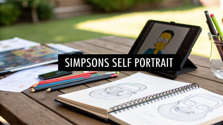
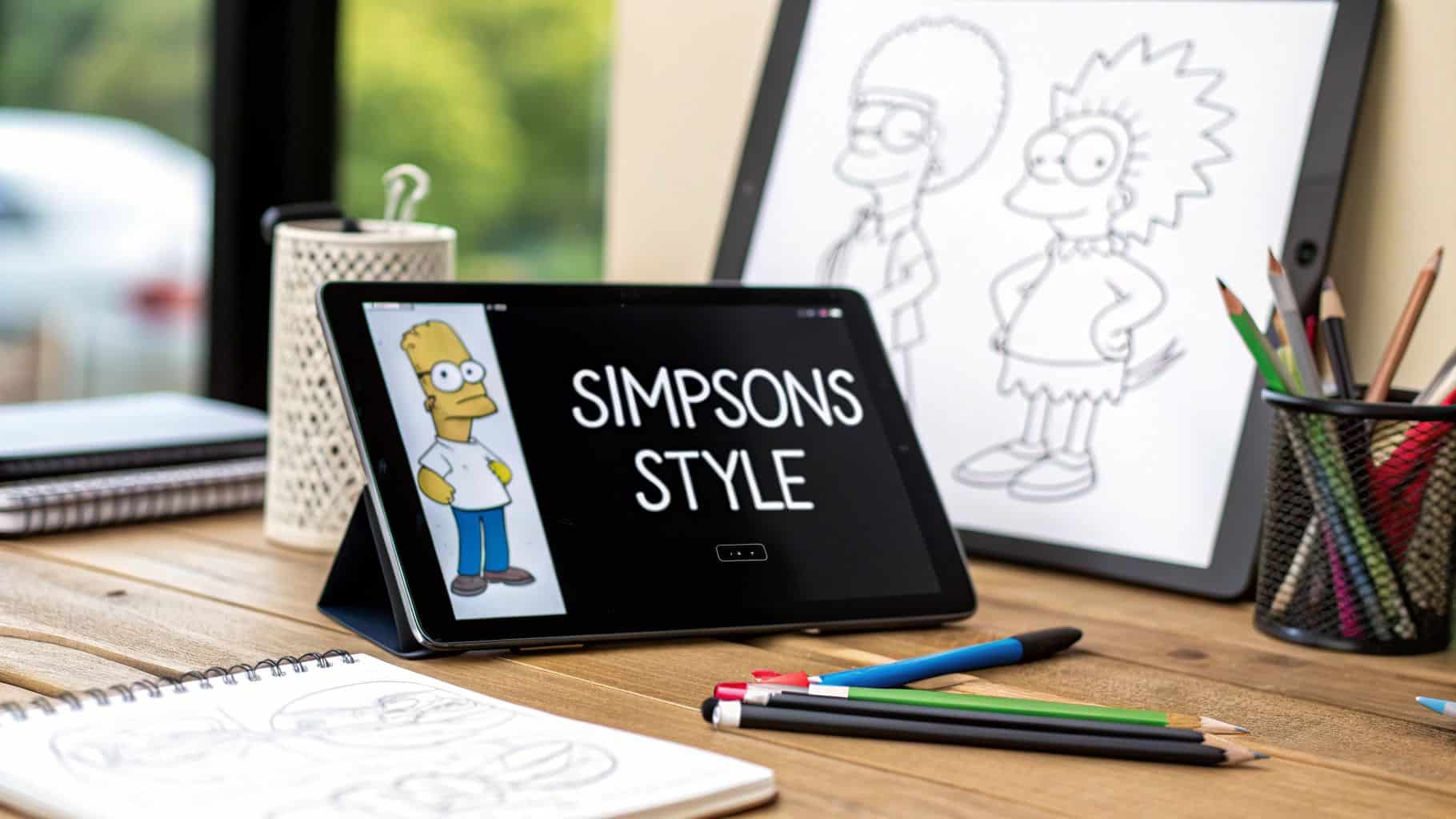
How to Draw in The Simpsons Style
Ready to try drawing yourself as a Springfield resident? It might look hard, but drawing in the art style is more about knowing a few key tricks than being a great artist. Once you understand the main ideas, you can break it down into simple, fun steps. Let’s walk through how to create your own “Simpsonized” portrait and put all this knowledge into practice.
The very first thing to do is forget about realism. Stop thinking about drawing a person and start thinking like an animator. You’re simplifying, not making a perfect copy. A head isn’t a complex, shaded oval; it’s a basic shape. For Homer, it’s pretty much just two circles stacked on top of each other.
Once you have that simple head shape, you can move on to the features that make the style so easy to recognize.
Mastering The Signature Features
The secret to a great Simpsons-style drawing is getting a few specific details just right. If you get the eyes and the mouth right, you’re 90% of the way there, as they show all the personality and emotion.
Let’s start with the eyes. They’re almost always big, white, and slightly bulging, with tiny black dots for pupils. Here’s the most important rule: the eyes must sit directly on the “muzzle” area, that rounded part of the face that includes the nose. They never float above it. This keeps everything feeling connected and true to the show’s unique look.
Next is the famous overbite. The upper lip and teeth should always hang just a little bit over the lower jaw. This is probably the most consistent design rule in the show’s 30+ year history. Get that right, and your drawing will immediately look real.
Remember, you’re not trying to be perfect. The original Simpsons art has a certain charm that comes from being slightly shaky and hand-drawn. Don’t worry about ruler-straight lines, in fact, you should avoid them! A little imperfection gives it character.
Building Your Character
With the face starting to look right, it’s time to add the final details that will bring your character to life. This means working on the hair, body, and—of course—those famous hands.
- Hair and Body: Think simple and bold. Bart’s hair is just nine clean spikes. Lisa’s is a jagged star shape. The bodies follow the same “no straight lines” rule. Arms and legs should have a gentle, noodle-like curve to give them that classic rubbery, animated feel.
- Hands and Fingers: Don’t forget one of the most well-known details of Springfield: everyone has only four fingers on each hand (one thumb and three fingers). It’s a classic animation shortcut, but it’s a detail that immediately sells the style.
To help you put it all together, I’ve made a quick checklist you can follow step-by-step.
Your Simpsonizing Checklist
Think of this table as your recipe for creating a real-looking Springfield character from scratch. Just follow the steps in order, and you’ll have a great start.
| Step | Action to Take | Key Tip |
|---|---|---|
| 1. Head Shape | Start with simple circles or ovals for the head. | Think about how Homer’s head is two stacked circles. |
| 2. Eyes | Draw two large, bulging circles for eyes on the muzzle. | Add small black dots for pupils to show where they’re looking. |
| 3. Overbite | Create the signature overbite with the upper lip over the lower. | This is a must-have for an authentic look. |
| 4. Hair | Choose a simple, bold hairstyle made of basic shapes. | Think in spikes, clouds, or simple lines. |
| 5. Body & Clothes | Draw a curved body and simple clothing. | Avoid straight lines to keep the look soft and animated. |
| 6. Hands | Add the four-fingered hands. | Don’t forget this classic cartoon shortcut! |
By following this guide, you can easily capture the unique spirit of the Simpsons art style. Before you know it, you’ll be creating fun portraits of yourself, your friends, or maybe even the family dog.
Why This Unique Art Style Still Works Today

How has a cartoon style from the 1980s stayed so popular and easy to recognize? It really comes down to two things: its brilliant simplicity and the way it perfectly matches the show’s humor. The style has a set of basic rules that have kept it from feeling old for over three decades.
This simple look is actually its secret weapon. The characters are built from such basic shapes and bold outlines that they’re very easy to copy and make fun of. This is what helped make the style a huge part of pop culture, showing up all the time in fan art, memes, and social media trends.
The Foundation of Timelessness
The style’s lasting power is not an accident, it’s just smart design. By sticking to a few main visual rules, like the signature overbite, the bulging eyes, and the four-fingered hands, the show created a look that is both unique and very flexible. It’s so iconic, you can still see its influence in modern animation and digital art.
This simple foundation gives the whole look a universal feel. If you drew a character today using the exact same rules from 1989, they would fit right into Springfield perfectly. It’s this consistency that has saved the style from being forgotten. The creators built a visual language so strong it became timeless.
The most brilliant part of the Simpsons art style is how it helps the comedy. The simple, almost innocent look of the characters creates a hilarious contrast with the show’s sharp, often adult jokes and social commentary.
This contrast is where the comedy magic happens. There’s just something funnier about a character with a goofy, childlike design saying a very sharp, satirical line than if they looked realistic. The art style almost lowers your guard, which makes the punchlines hit that much harder. The visuals aren’t just a container for the jokes; they’re a key part of the humor itself.
The Perfect Partner for Humor
Think of the art style as the perfect straight man for the show’s clever writing. Homer’s dopey, simple expression just makes his moments of surprise genius or extreme stupidity that much funnier. The art puts the audience in a funny mood, creating a world where anything can happen.
- Visual Gags: The stretchy, rubber-like bodies of the characters allow for over-the-top physical comedy that realistic animation just can’t do.
- Emotional Contrast: Those simple faces can switch from pure joy to intense anger in a single frame, which greatly improves the comedic timing.
- Cultural Shorthand: The yellow skin is so easy to spot it makes the show stand out in a sea of other content. For a deeper dive, you can learn more about the specific reasons why are the simpsons yellow in our other article.
Its simplicity keeps it timeless and easy to adapt, while its clever design makes it the perfect vehicle for the show’s legendary humor. It proves that a strong, clear visual style is one of the most powerful things you can have.
Common Questions About The Simpsons Art Style
Even after going deep into the history and design rules, some questions about the famous Simpsons art style often come up. Let’s answer some of the most common questions about the look and feel of Springfield and its memorable residents.
The biggest question everyone asks is, without a doubt: why yellow? Creator Matt Groening has said he wanted something that would grab your attention right away. Back in the day, when you were flipping through TV channels, that bright flash of yellow was meant to make you stop and say, “Oh, The Simpsons is on.” It was a smart, simple marketing trick that definitely worked.
People also wonder who first drew the characters. The credit for that goes to Matt Groening himself. He famously sketched the whole family in just a few minutes while sitting in a lobby, waiting for a meeting with producers. The drawings were pretty rough, but they had the basic idea of a style that animators would spend the next 30+ years perfecting.
More Fun Facts And Details
Here are a few more quick answers to questions that fans and new artists often have about the show’s visuals.
- Who finalized the character designs? Groening created the first spark, but a team of animators, especially Gyorgyi Peluce, was in charge of improving those first sketches for the first season. They cleaned up the lines and finalized the character models we know today.
- Is the style difficult to animate? You’d think its simplicity would make it easy, but that’s not quite right. While the drawings are simple, keeping every character looking the same across thousands of frames and showing real emotion with such simple features takes a lot of skill.
- Where can I find cool, unique merchandise? Besides the official products, many people want custom art. If you’re looking for ideas, you can find some fantastic inspiration for custom Simpsons gifts that really celebrate this one-of-a-kind art form.
That’s it for today!